
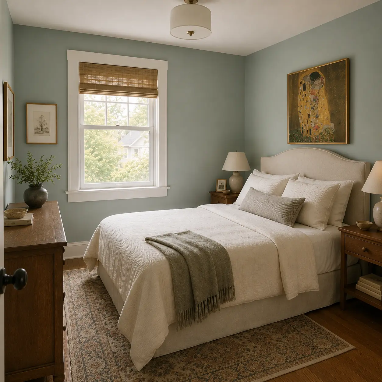
Quiet Moments Bedroom
A modest bedroom wrapped in a soft blue-green that feels calm and familiar, with warm wood and collected artwork.
A room works when the relationships feel intentional.
Quiet Moments sits between blue, green and gray, which allows it to change subtly as bedroom light changes throughout the day. Warm wood and soft neutral textiles prevent the cooler wall color from feeling chilly, creating a room that encourages visual quiet.
Quiet Moments 1563
The elements behind the feeling.
Use the board as a design direction—not a shopping list. The relationships between color, texture and material are what make the room work.
- Clean transitions between wall, trim and architectural details
- A color temperature that complements the room’s permanent materials
- Enough contrast to create definition without fragmenting the room
- Natural and artificial light considered before final color approval
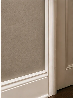
Quality shows at the transitions.
Crisp edges, even coverage and thoughtful sheen selection are what make premium architectural paint feel finished. The details are especially visible where walls meet trim, doors and millwork.
Blue-green-gray colors can shift noticeably between morning daylight, afternoon light and warm artificial lighting.
Love the feeling of this look?
We can help you explore how this color, finish and overall direction could work with the light, architecture and materials already in your home.
Ask About This LookMore rooms with a similar feeling.
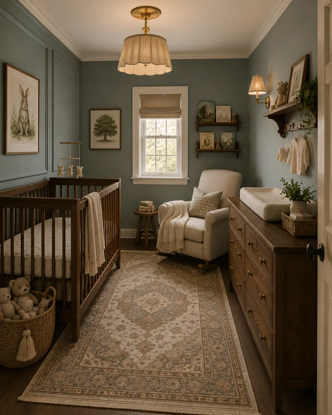
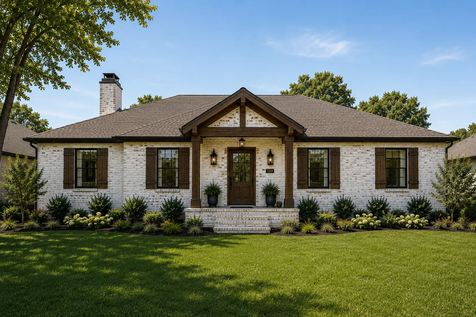
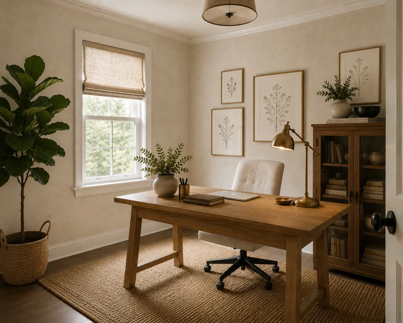
Heritage Wall Works Inspiration Gallery images are design visualizations created to explore color, finish and design direction. They are not photographs of completed Heritage Wall Works projects.
Paint and finish appearance varies with lighting, surface conditions, application and display. We recommend evaluating samples in your home before making a final selection.